


Black and White Photos by REHP
 A while back I did a poll on Instagram to find out what type of blog posts people were interested in reading. Many people said they wanted to see behind the scenes posts. So here we are! Today I’ll be sharing lots of behind the scenes info about my black and white photos.
I love black and white photography. I love it so much, a few years ago I did a completely black and white photo session! (If you’re interested in doing one of these, just ask! I would love to do this again!) Since I love b&w photography so much, my clients get 10% of their final images with black and white copies. That means, if there are 100 color photos, I will make black and white copies of ten of them. That way they get the color version and the b&w version.
I thought it would be fun to walk you through my thought process of how I choose which images will get black and white copies. (It’s not appropriate for all photos.) This was cool to write because it really made me think through my process and the why behind what I do. Photography comes pretty instinctually to me, so I don’t overthink it while I’m doing it. I just flow with it! It’s nice to know I actually have a lot of good reason why I do this! haha
Below you’ll see the six reasons why I will make black and white photos. (One photo may include one or more of these elements, not necessarily all.) Under each reason you’ll see the criteria for when I will make a black and white photo, and when I won’t. Enjoy!
STRONG CONTRAST
I found a definition of contrast here:
“A principle of art that refers to the arrangement of opposite elements (light vs. dark colors, rough vs. smooth textures, large vs. small shapes, etc.) in a piece so as to create visual interest, excitement and drama.”
From that definition, what I’m referring to here is the light vs. dark colors – specifically, black and white.
When I was starting out, a photographer friend of mine (thanks, Ricardo!) told me the marker of good b&w photography is strong blacks and strong whites, with minimal grey tones. That definitely influenced my creation of black and white images, and still does to this day.
When I will…
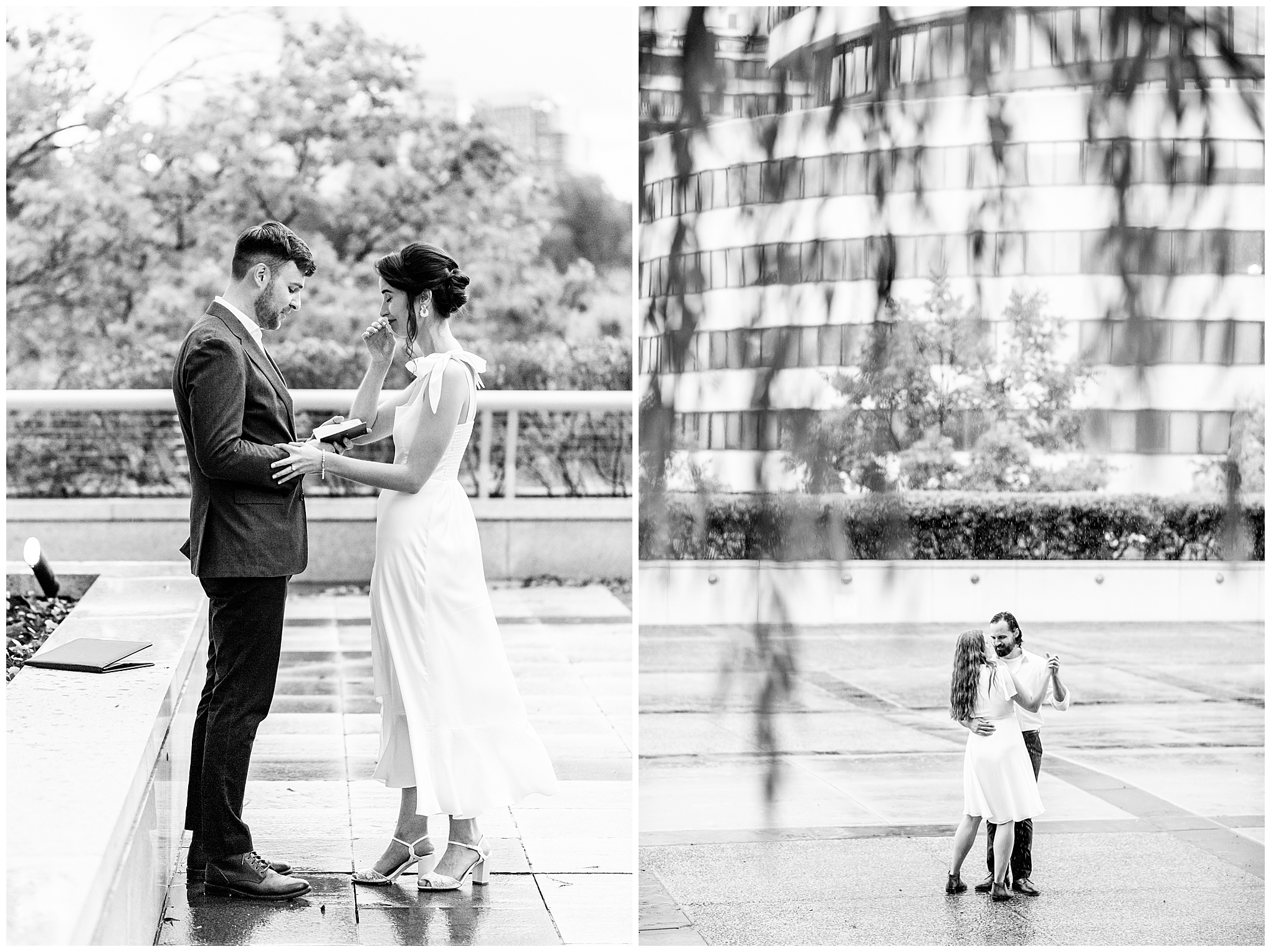
I will make an image black and white if there is strong contrast between light and dark. This could be where the subject is in darker clothes against a light background, like this photo:
Or if it’s a close-up photo, if there is dark clothing and/or hair surrounding lighter skin, or vice versa.
When I won’t…
If everyone is in light clothing, has light hair, and is in a light setting, I usually will skip making too many black and white images. That setup creates a situation where the resulting image would include varying light grey tones and no strong black and whites, as I like.
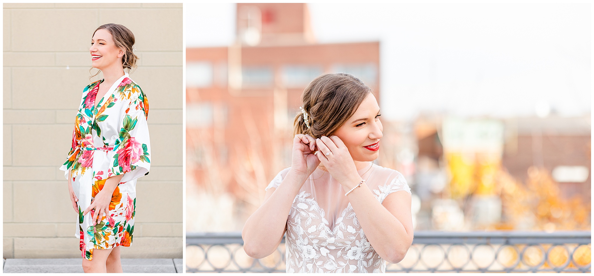
LIGHTNESS
Each photographer has their own distinct style, and I call my photography ‘light and bright’. I want to keep the majority (like 95%+) of my images pretty light. That means I am focusing on including lighter elements of the setting. I’m also using camera settings to create lightness in a variety of ways. This applies to color photos as well as black and white.
When I will…
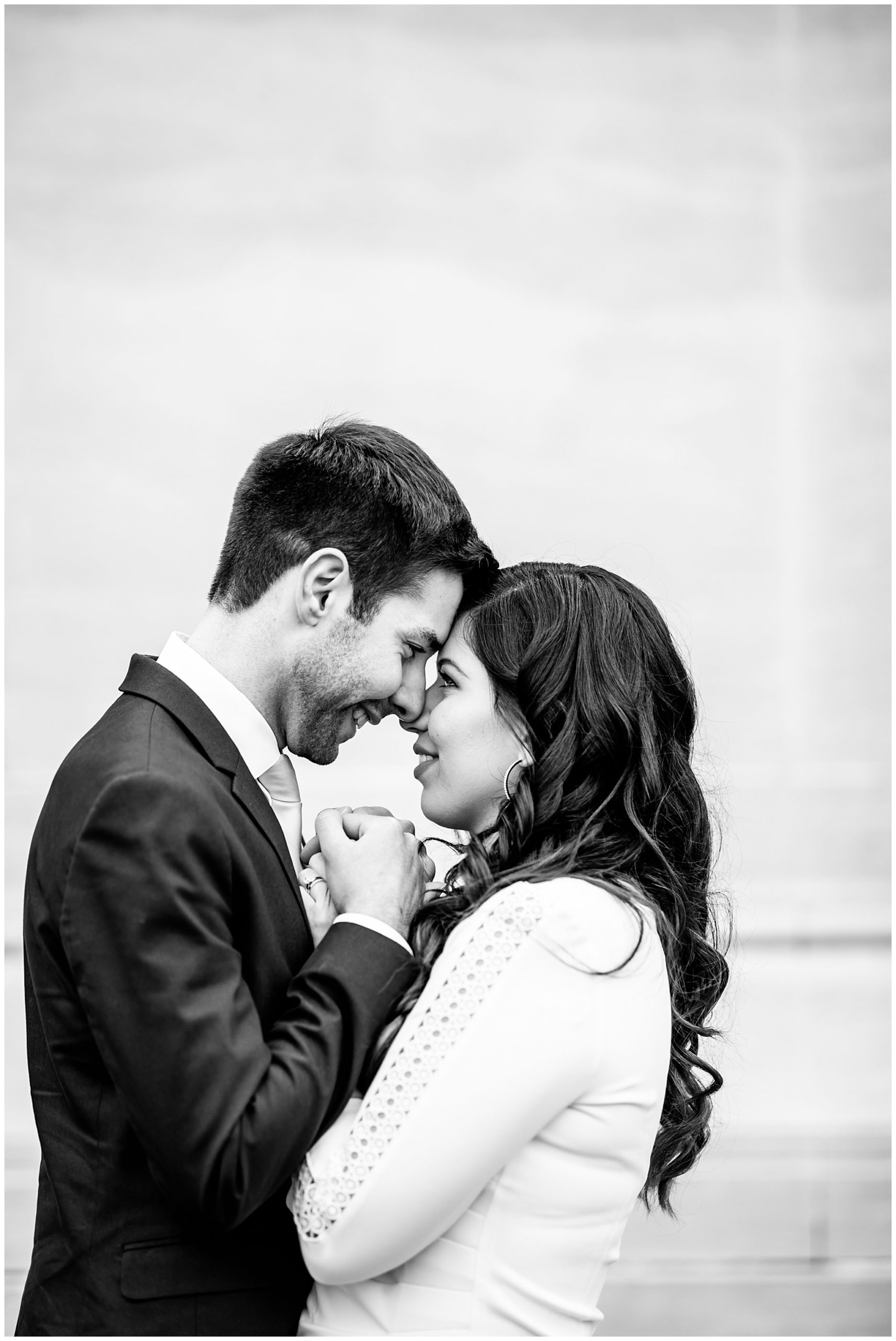
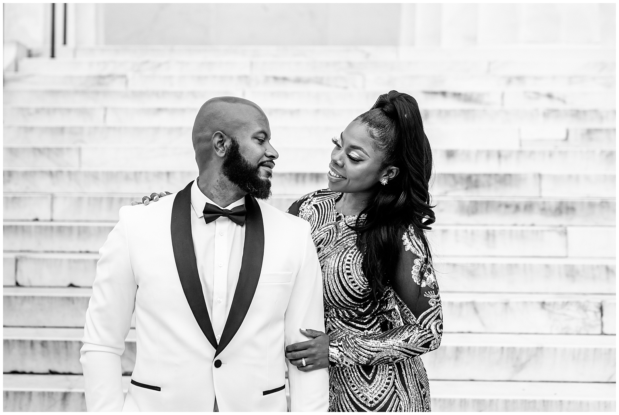
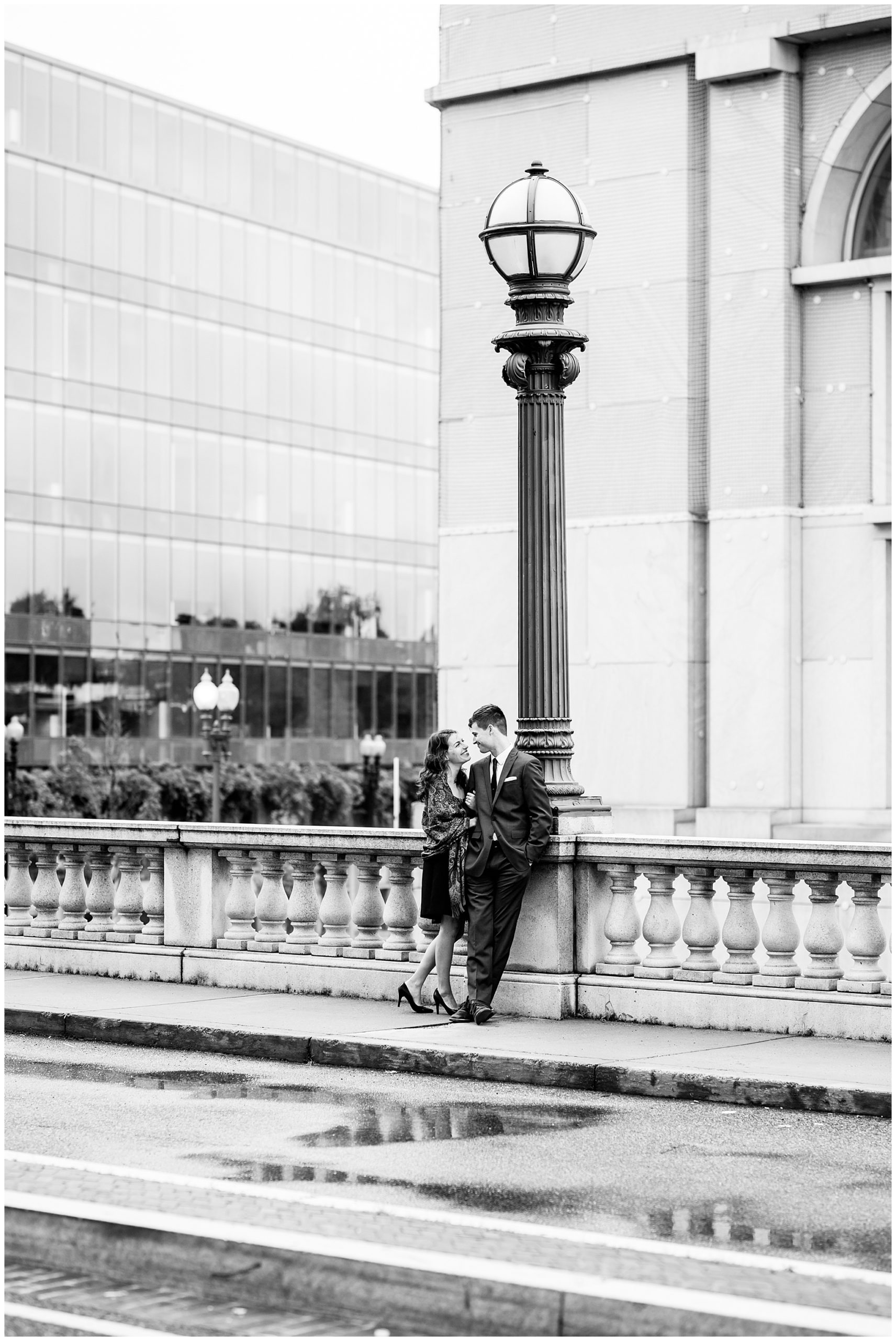
I will make a black and white copy of an image, if doing so will still keep the image light overall. For example, the below photo. The couples’ beautiful dark skin, the woman’s long dark hair, and her dark dress are balanced by lots of white in the background and the man’s tuxedo, keeping this image light overall.
When I won’t…
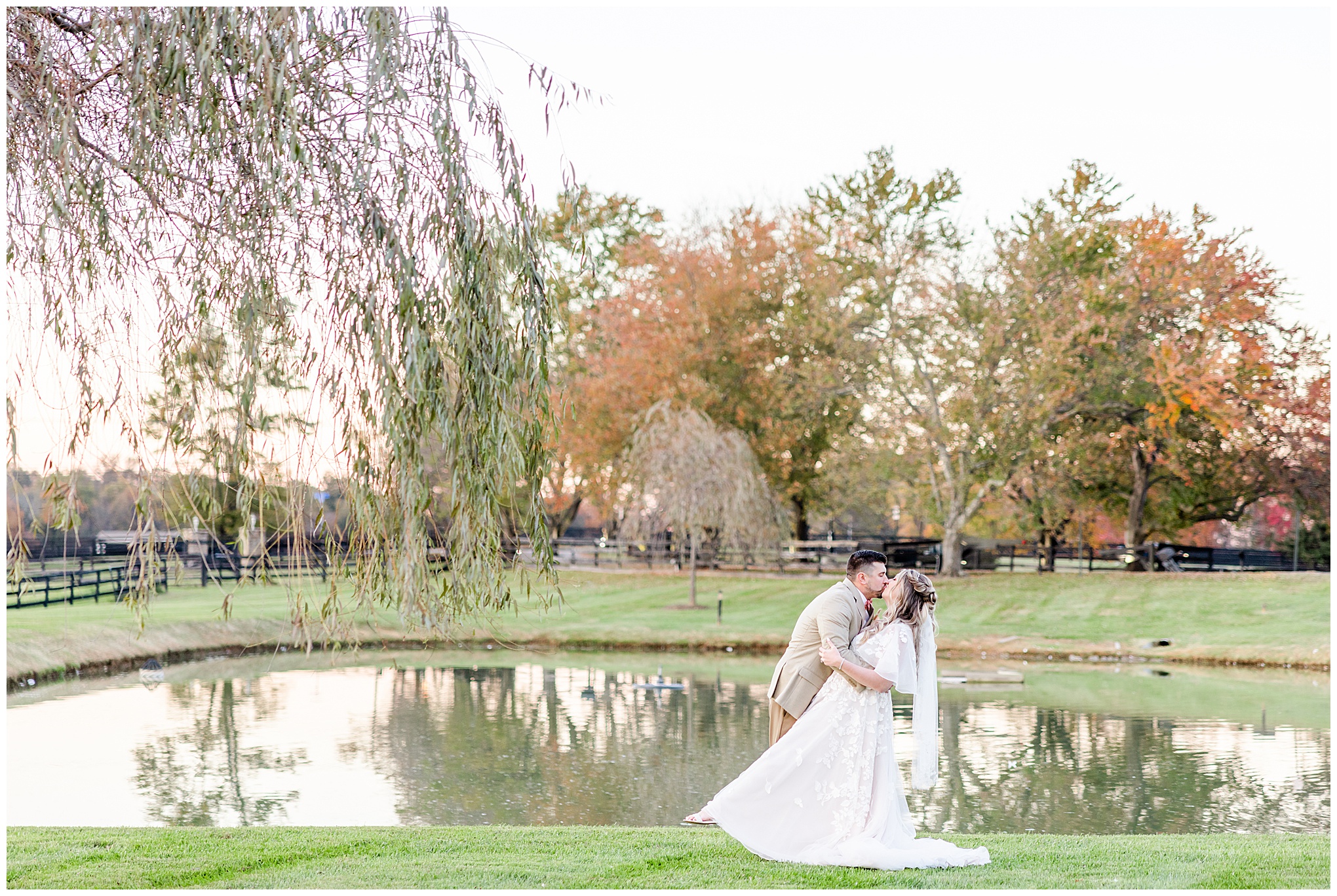
If making the photo black and white would make the image too heavy overall, I won’t do it. For example, if the background is like a bunch of flowering bushes. In color there is bright greenery, bright flowers, and will appear light. If I make that photo black and white, the background will be completely dark, making the photo heavy. Or, another example – if the subjects are standing in front of a pond, as seen below. In color you can see the pond appears light green and orangish-white, and vibrant. In black and white it will appear as a big dark hole, weighing down the photo.
SIMPLICITY
To me, this is an important element of black and white photography. And it goes back to the previous two elements: contrast and lightness. And this also manifests in a multitude of ways, which I’ll get into below. The beauty of black and white photography is that you are stripping a lot out of the scene, creating more visual simplicity in the image.
When I will…
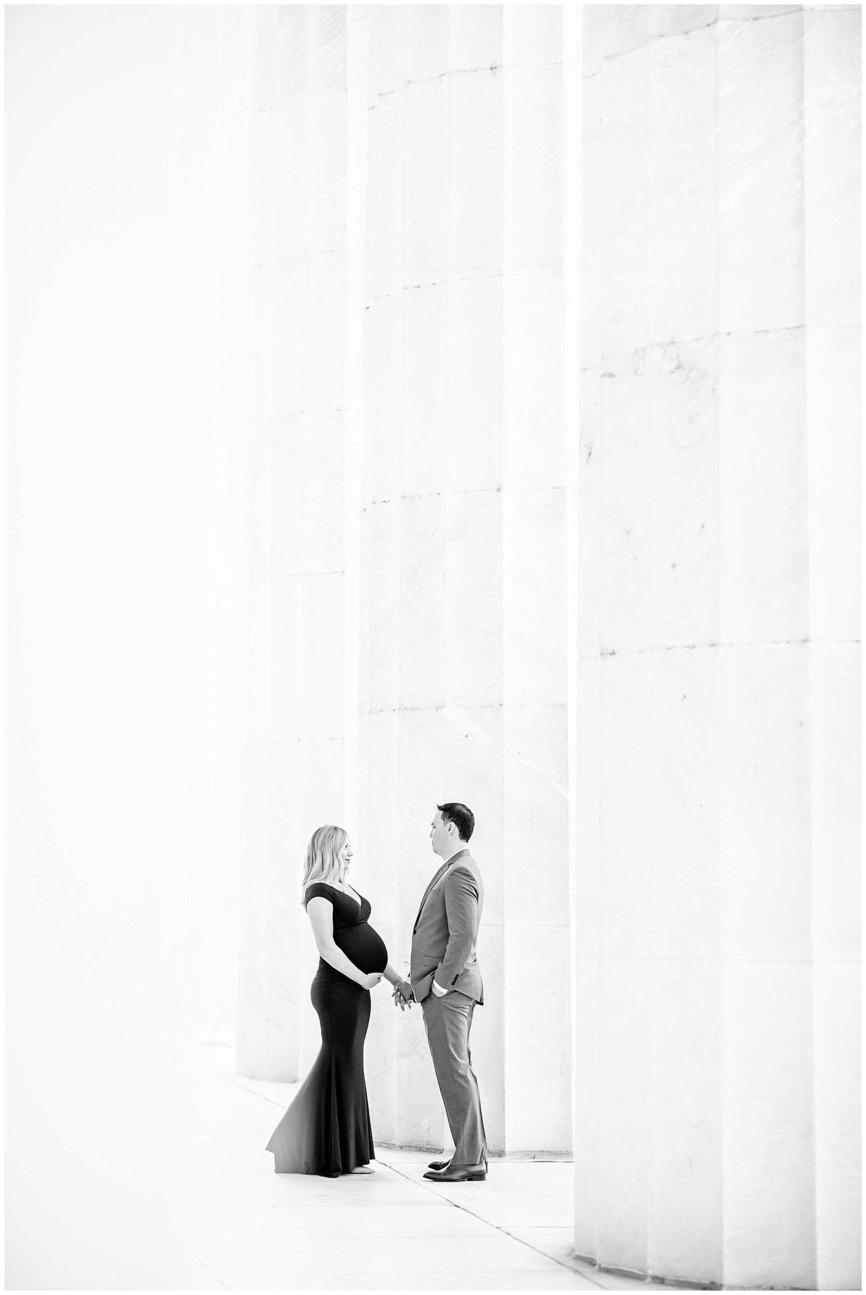
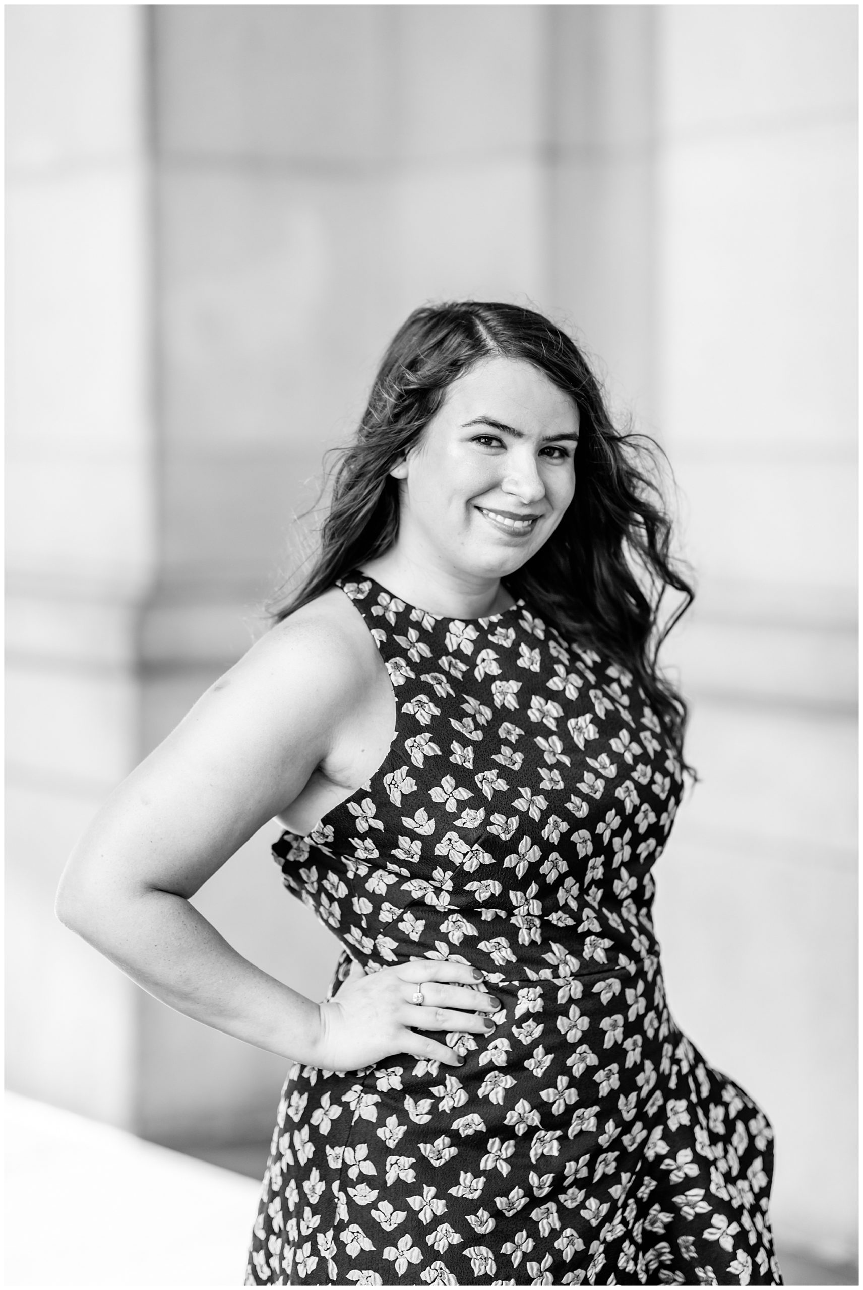
If the background of the photo is simple, I will feel free to make a black and white copy. A wonderful example is seen below: the woman is standing in front of a very plain background, a wall. She pops off the background, and the background is not distracting. All your eye has to focus on is your subject.
When I won’t…
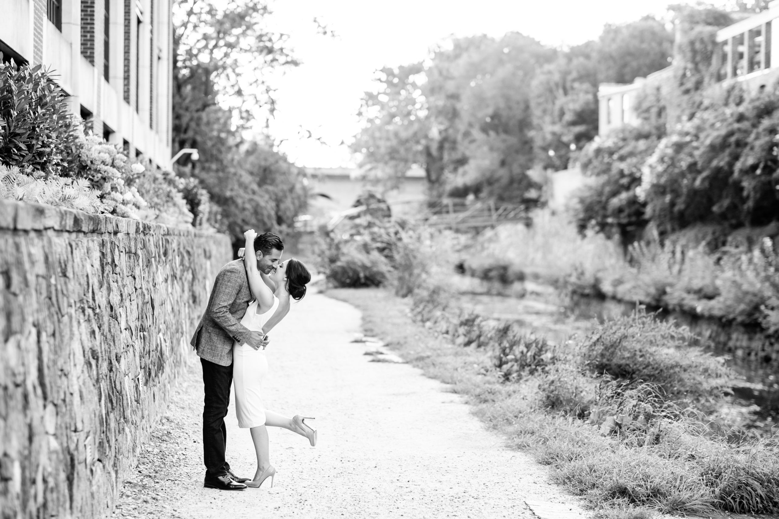
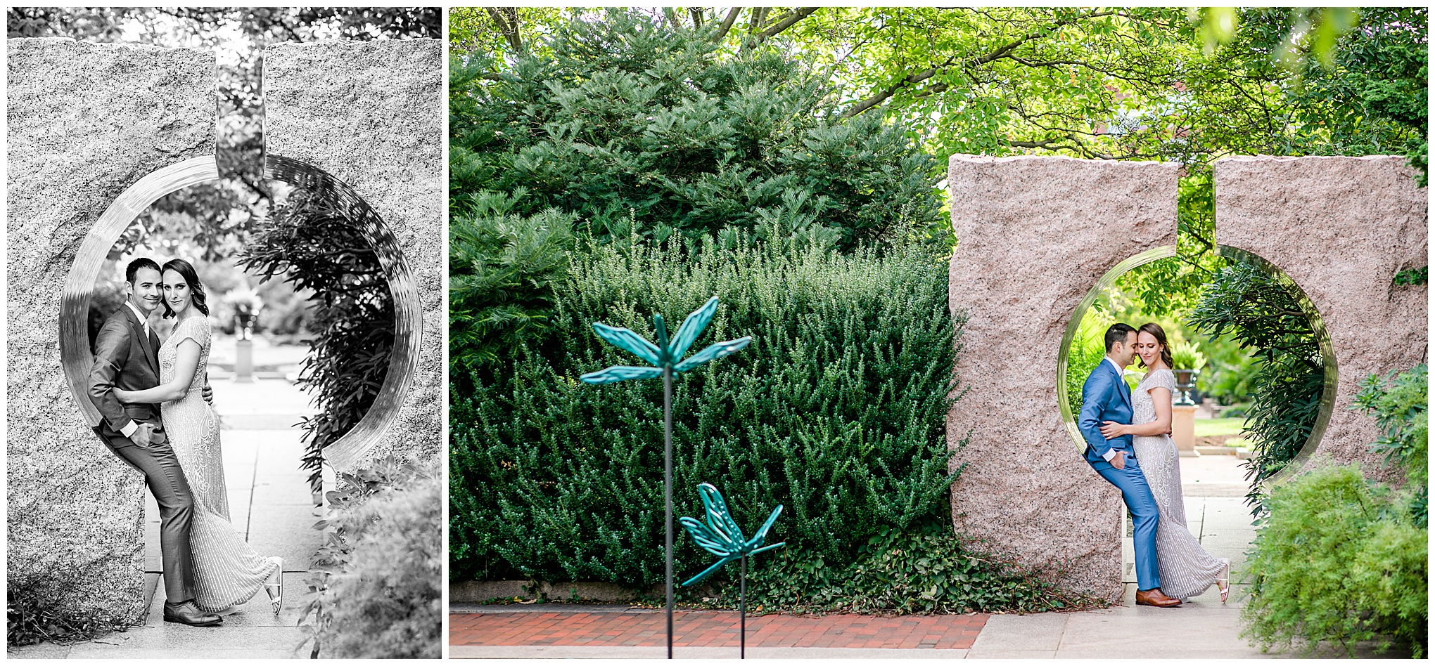
If the background of the photo is busy (by busy I mean very rich in texture or repeating shape, or cluttered), I will skip making a b&w copy. You can see in these examples below – the left photo I made b&w because it’s a closer up pic, eliminates a lot of the busy bushes to the left, and the couple’s bodies are in front of an area where there is nothing directly behind them. They pop against the background. On the right, there is the busy-ness of the dark bushes and so many textures going on. A black and white copy would be too busy.
If making the photo black and white will make it so your subject meshes in with the background, or said another way – if you’re subject won’t stand out from the background, I won’t do it. What would happen is if everything is just black, white, or grey, is that everything in the frame would be competing for your eyes’ attention. Nothing will stand out or draw your eye. Like in this photo – there are so many textures and similar tones going on that I think the couple would blend into the background if I made this image black and white. This was the case with most of this session because of all the nature – texture, busy-ness.
EMOTION
Black and white photos are renowned for evoking emotion. That’s because with the color stripped out, there is less to focus on as a viewer. Each remaining element within the image stands out more because it has less to compete with.
When I will…
I will make a black and white copy of a photo in order to highlight the emotion within the image, generally:
romantic / quiet / serious / dramatic
I will also make black and white images in order to amplify / highlight something classic or nostalgic; to evoke an old world scene, vibe, reminiscent of something classic. Photography started out as black and white and there are so many iconic black and white images. If I notice an element of that in a photo I’ve taken, I will strip out the color, so the black and white photo becomes a call-back to a different time. An homage to the original, like this image of Rachel and Wes:
When I won’t…
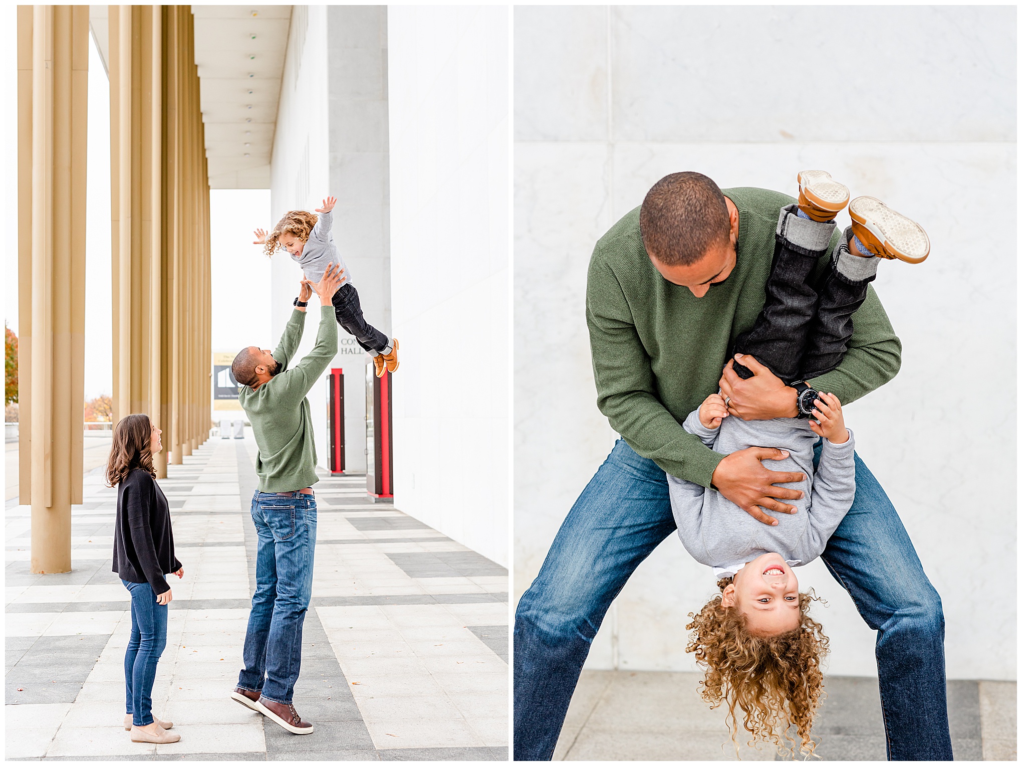
I typically don’t make black and white copies of photos where people are laughing / joyful / silly. This isn’t a hard and fast rule, but one I generally follow. When someone is joyful, I want to keep all elements of the original photo in tact. The color helps bring that joy to life. See?
VISUAL INTEREST
This is a tough one to describe. The best way I can describe it is by giving examples:
When I will…
If there is a really clean or interesting leading line in a photo, with minimal distracting elements, I will make a black and white copy. For example, a raised wall along a walkway, the outline of a building, or a bare tree branch.
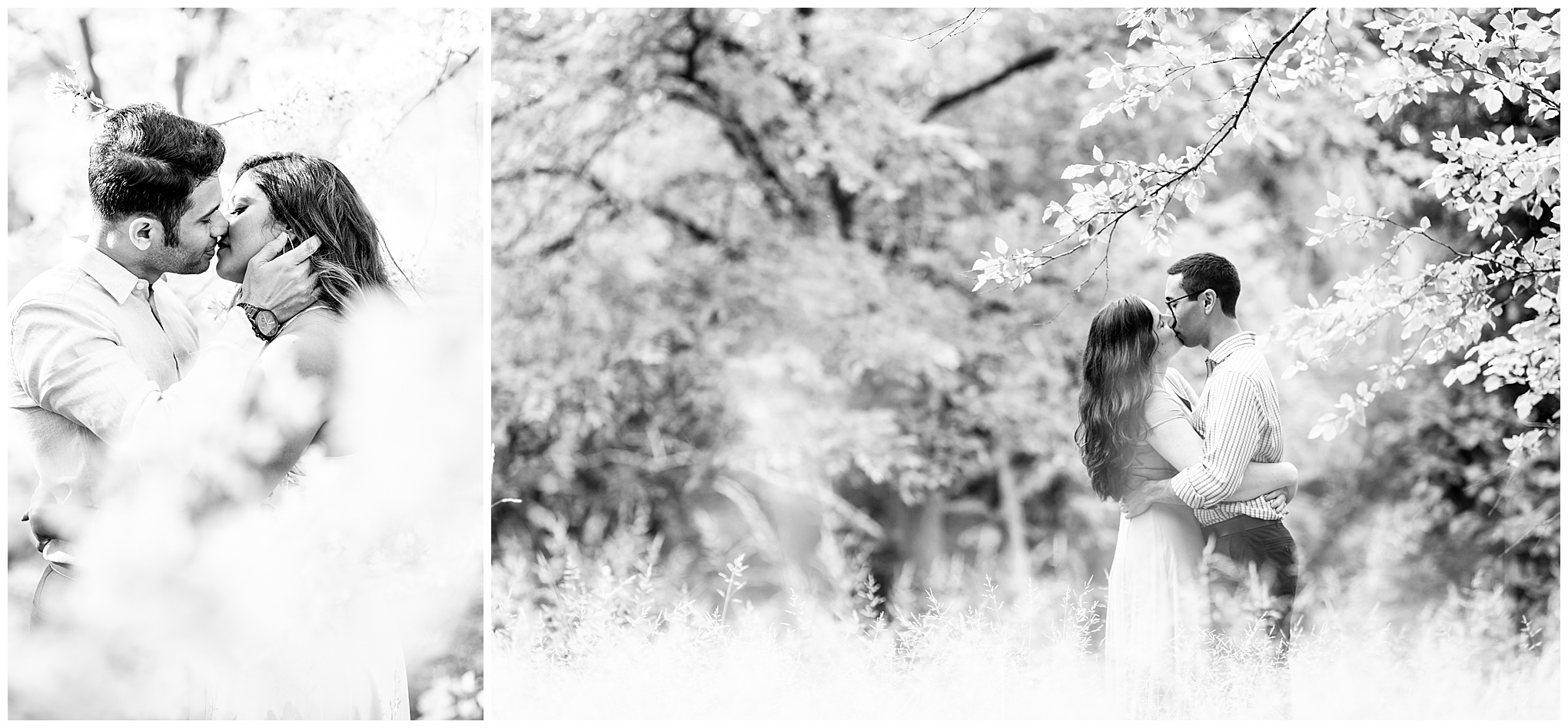
Another thing I think of when it comes to visual interest is when there is really soft foreground surrounding the subject to make a super romantic or ethereal look.
When I Won’t…
In this case, I won’t make a black and white copy of the photo when the colors are so rich and complement each other well. To me, the complementing, rich colors create the visual interest so much so that it feels like a crime to strip out such beautiful color. Such is the case with these photos of Katherine. I typically make lots of black and white photos of the bride getting ready – but with Katherine, I skipped them because the light on this day was perfect. It really allowed the colors of the scene to sing and I didn’t want to take that away!
FIXES
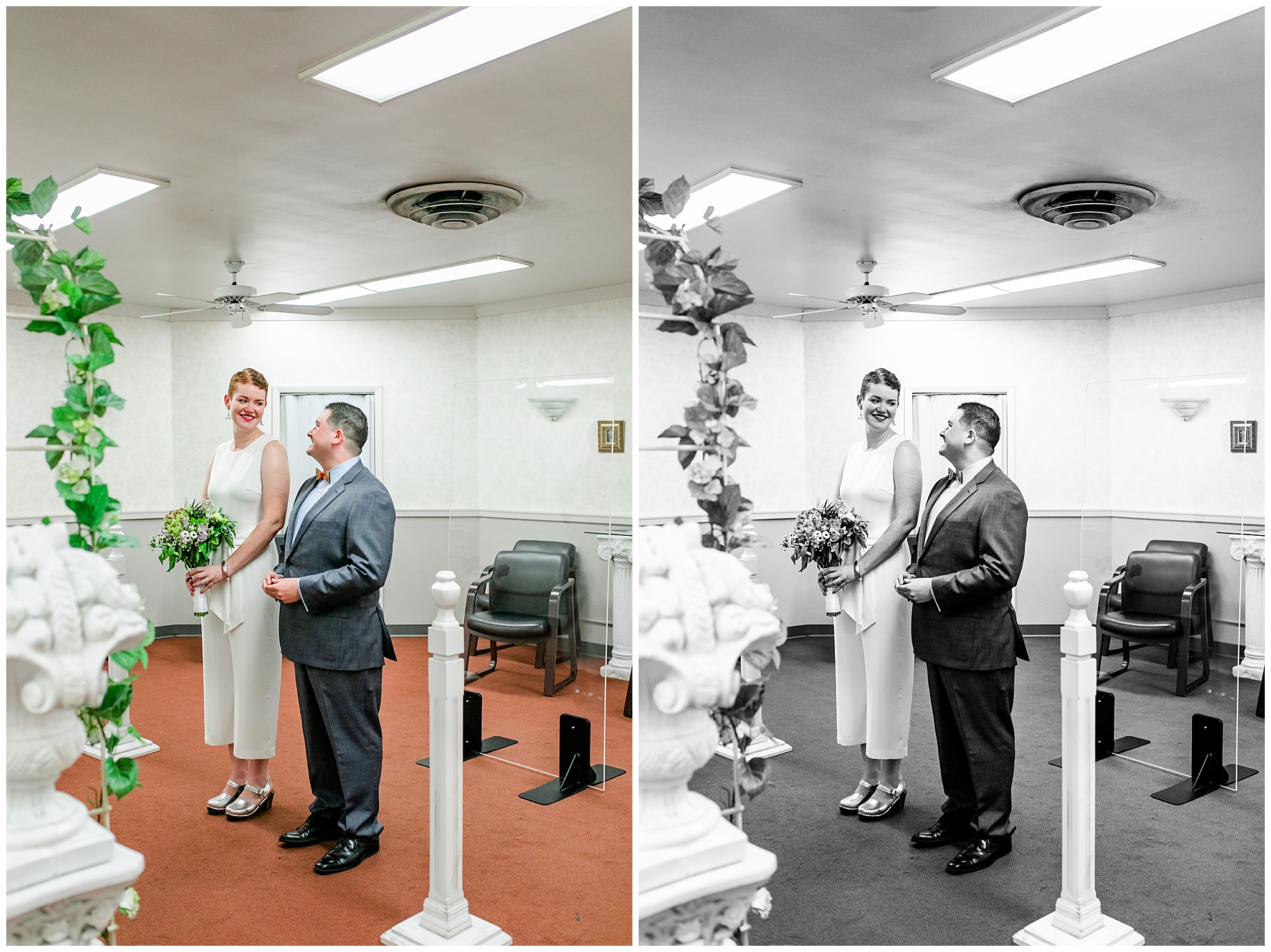
Every photographer will tell you they sometimes use black and white photos to cover up or fix a technical error, or something that couldn’t be helped and just doesn’t look good in color. And I am no different. I will make a black and white copy of a photo in order to save / de-emphasize technical imperfections, or just things that don’t mesh with my style, such as:
Weird Coloring
Lots of things can affect the coloring of an image – certain paint colors in a room, lots of overhead trees casting green onto skin tones. Stripping out the color makes these things less obvious and therefore less distracting.
If you’re indoors and don’t have time for a full flash setup with gel for your flashes, indoor lighting will affect the color of your images. The best example of this is inside a courthouse for a civil ceremony. The lighting is often either – fluorescent (green), which will affect skin tones. There are some things you can do in-camera, but ultimately if it gets too weird, I’ll make a black and white copy. Like in this photo below, the color copy has a hint of green to it.
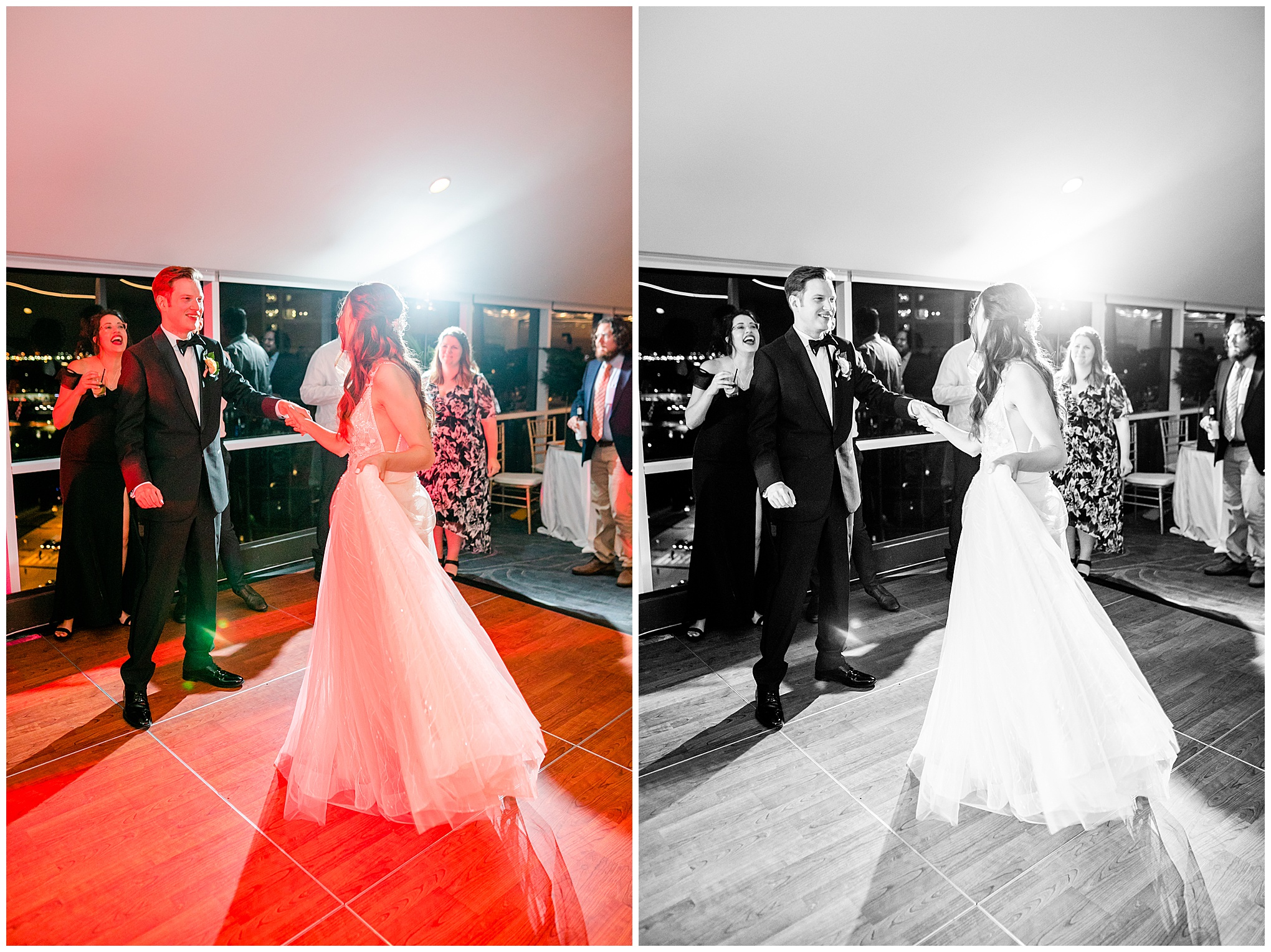
The worst offender of weird light: dance floor uplighting by a DJ or band. Ugh. Every wedding photographer’s nemesis. The entertainment will set up these little lights around the perimeter of the room (sometimes the venue will do this as well – but at least the venue uses a consistent color throughout the evening) or dance floor, and those lights flash different colors. The colors land on people, making their faces that color – purple, red, orange, green, blue, etc. It’s the worst. Sometimes it can be fun for dancing photos, but when every single image has a blob of color on someone’s face – it ain’t cute. I’ll make black and white copies of some of those photos.
When there is a non-ideal or distracting color(s) in the room, I’ll create many black and white copies. This happens a lot in churches. Some churches will have the ugliest color carpeting or wall colors. Colors that don’t otherwise go with the rest of the vibe of the wedding. It happens sometimes in reception halls too – where the colors of the decor don’t match the rest of the wedding colors.
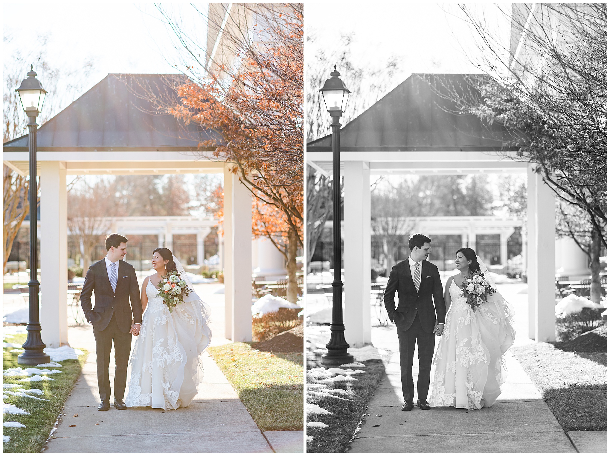
Light
Sometimes when shooting outside, if the sunlight goes directly into your lens, it will create what’s called haze. That’s where the image ends up not being as sharp or crisp or clear, and more on the grainy side. The colors turn out muddy, and that isn’t aligned with my style. When that happens, I’ll often make that photo black and white. In b&w, the haze looks like a cool effect.
If there is a technical mistake that happens in-camera, I’ll make the image b&w. What I’m thinking of here is when I’m shooting a reception and using flash – sometimes (rarely) the flash won’t fire because it needed time to recycle between shots. When this happens, the image will be under exposed (dark). If that happens and I really love the image, I’ll brighten it up in my editing software, but that will make it super grainy. I’ll make that a black and white copy so my client still gets the good photo, and stripping the color away makes the grain matter less.
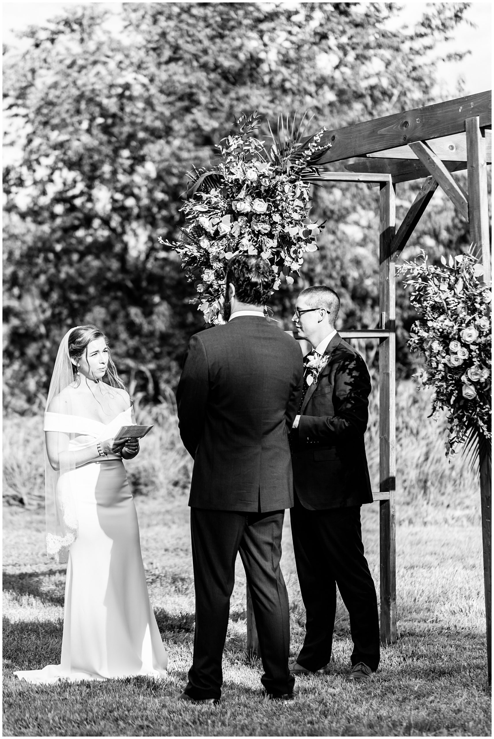
And finally, if the sun is shining directly onto a client during a candid moment, such as during a ceremony, stripping out the color makes that less obvious and allows you to focus on the emotion of the scene.
Did this post get you excited to book your own wedding, micro-wedding, elopement, or engagement session?! If yes, send me a note and we can chat about what you have in mind: contact me
Hi – I’m Rachel! A wedding, engagements, and headshots photographer in Washington, D.C., Maryland, and northern Virginia. I love taking photos of elegant people who love to laugh, as well as of much in-love couples. If you’re a dog owner, that’s a plus! I’m currently booking 2022 portrait sessions, as well as 2022 and 2023 weddings.
